Mikky Rama — Brand & Creative Senior Designer
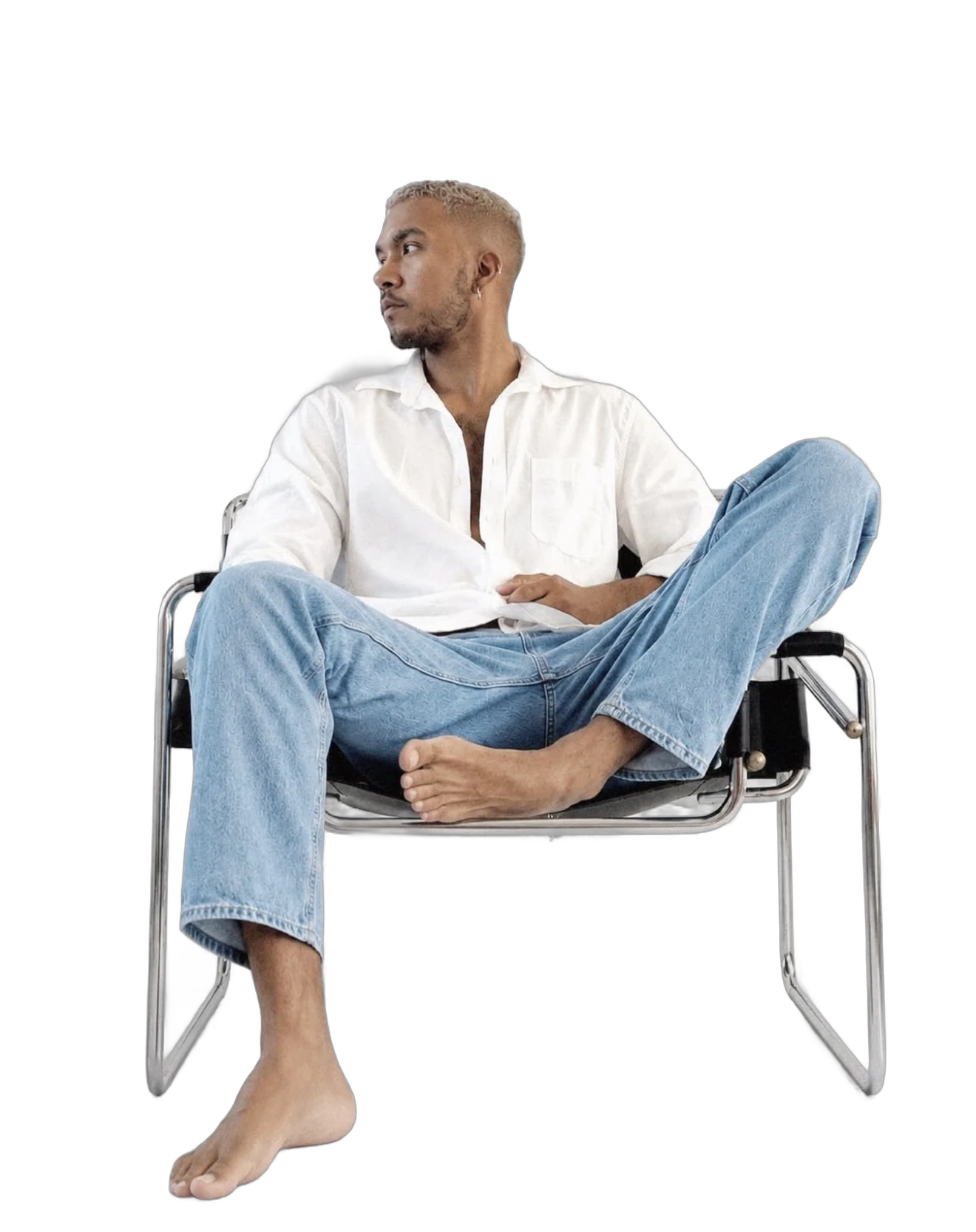
10+ YRS
EST. 2014
BRANDING • MARKETING • DIGITAL • MANAGEMENT
WHO I AM
Building brands, experiences and creative systems that connect people with businesses.
↓ MEET MIKKYWHO I AM
MORE THAN A DESIGNER.
I am a brand and creative professional with 10+ years of experience across hospitality, lifestyle, marketing and e-commerce.
My work sits between strategy and execution; understanding what a brand needs to achieve, defining how it should communicate, and translating that thinking into creative experiences across multiple touchpoints.
Brand & Creative
- Brand identity & strategy
- Creative direction
- Campaigns
- Art direction
Brand Experience
- Hospitality
- Signage
- Events
- Physical experiences
- Collaterals
- Packaging
Digital & E-commerce
- UI/UX
- Amazon
- Storefronts
- Digital campaigns
Production & Leadership
- Print production
- Project management
- Mentoring
- Work process
MY CAREER
10+ YRS
–
Evolution Ltd
Mac Operator
–
Attitude Hotels
Junior Designer
–
Attitude Hotels
Senior Designer
–
BMS
Senior Amazon E-Commerce Brand Designer
Production →Design →Brand →Digital →Creative Strategy
- 10+ years
- 8 years at Attitude Hotels
- Amazon e-commerce
WHAT I BRING?
I THINK IN SYSTEMS.
Brand thinking
I don't only design the asset. I consider how it fits within the larger brand.
Creative direction
I turn objectives and briefs into visual concepts, systems and campaigns.
Cross-channel experience
Print, digital, social, websites, e-commerce, packaging, events and campaigns.
Business awareness
Creative decisions should ultimately serve an audience and a business objective.
HOW I WORK?
Collaboration
Working with marketing, digital and other stakeholders to translate objectives into creative solutions.
Ownership
Taking projects from idea through execution and production.
Mentorship
Sharing knowledge, giving constructive feedback and helping improve creative output.
Continuous learning
Exploring new tools, technologies and approaches to improve creative processes.
LET'S EXPLOREMY WORK.
CASE STUDY 01
Heart of Moris
- Brand identity
- Creative direction
- Campaign
- Events
THE IDEAThe rhythm of Mauritius
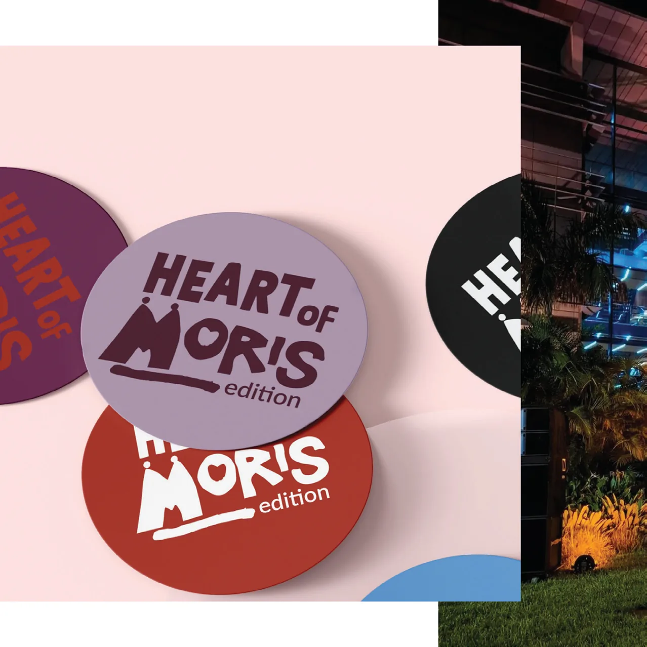
Heart of Moris was built around a simple idea: Mauritius has its own rhythm.
Not just through music, but through its people, landscapes, energy and the way different cultures and experiences come together.
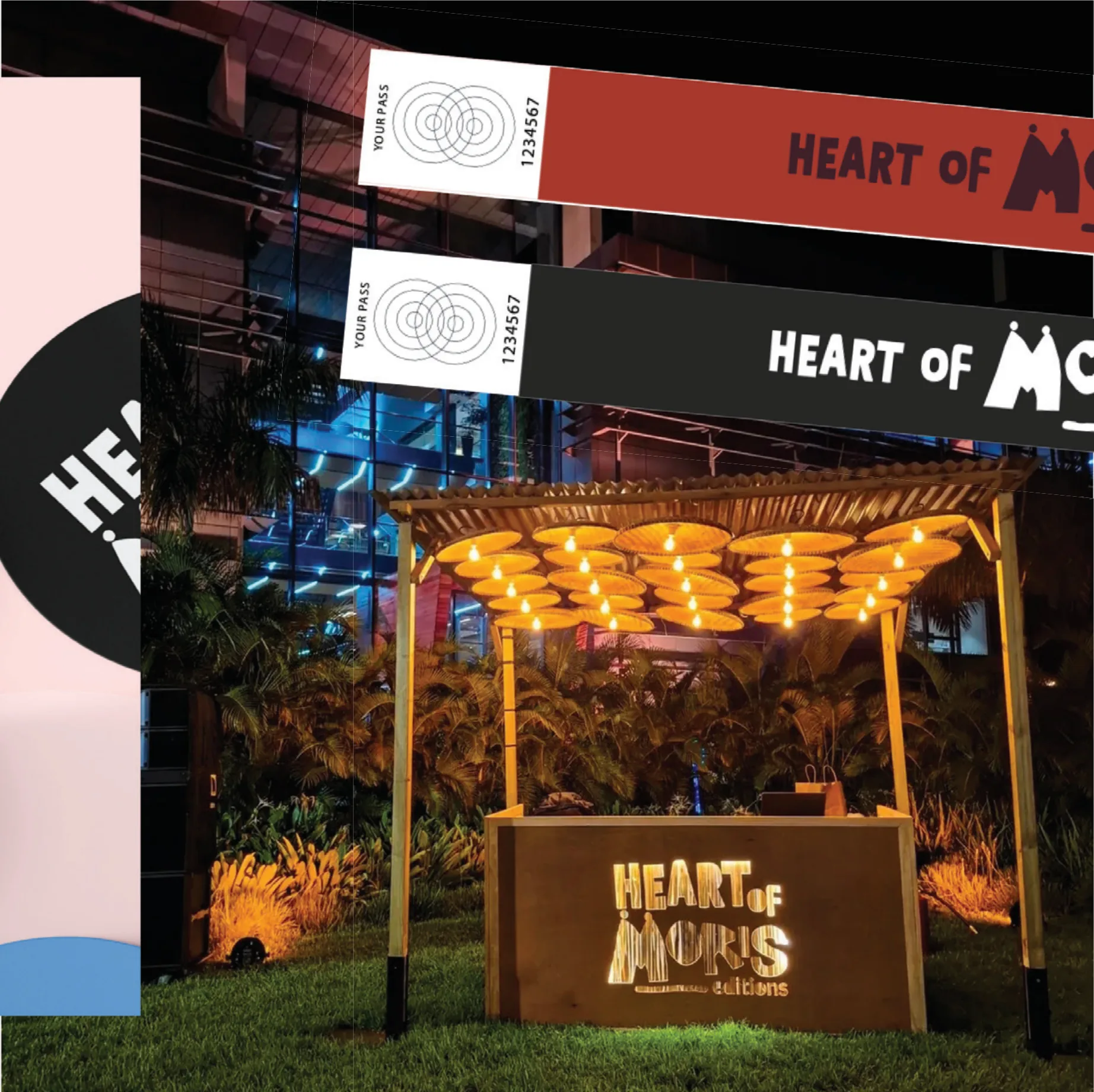
The identity translates that sense of movement into a bold, expressive visual language designed to feel contemporary while remaining rooted in Mauritius.
The objective:
Rather than creating a static logo, the objective was to create an identity that could move, adapt and live across different experiences.
ONE BRAND.MULTIPLE STORIES.
The Visual Language
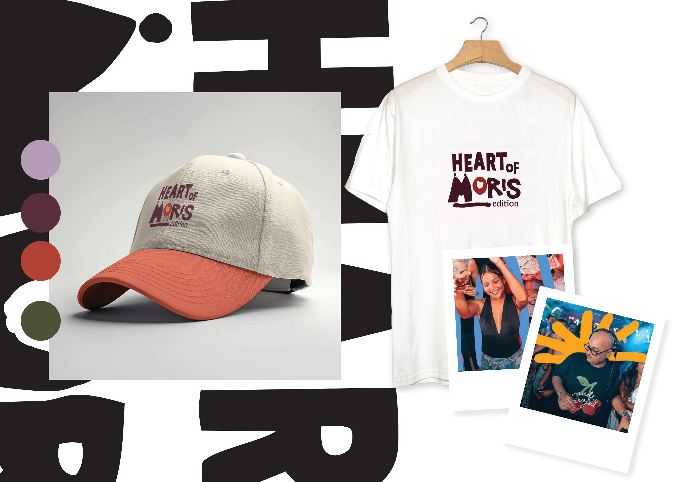
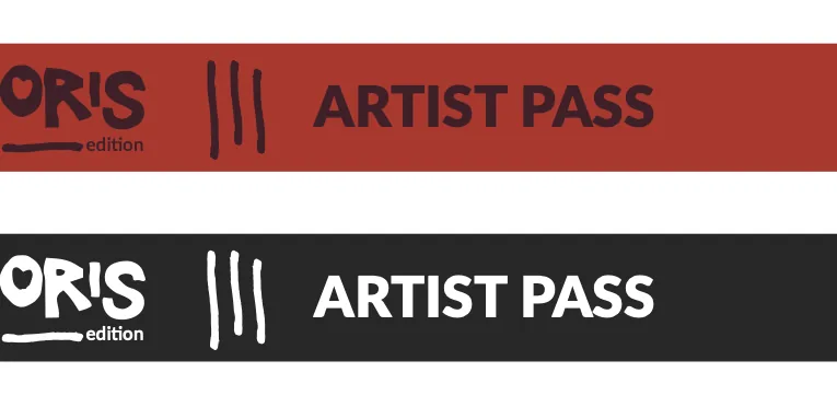
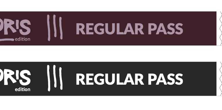
The identity was designed to feel bold, rhythmic and unmistakably Mauritian.
Typography, scale and weight create a sense of movement, reflecting the energy and spontaneity of the Heart of Moris experience.
3 Hidden references
HOVER TO DISTORT
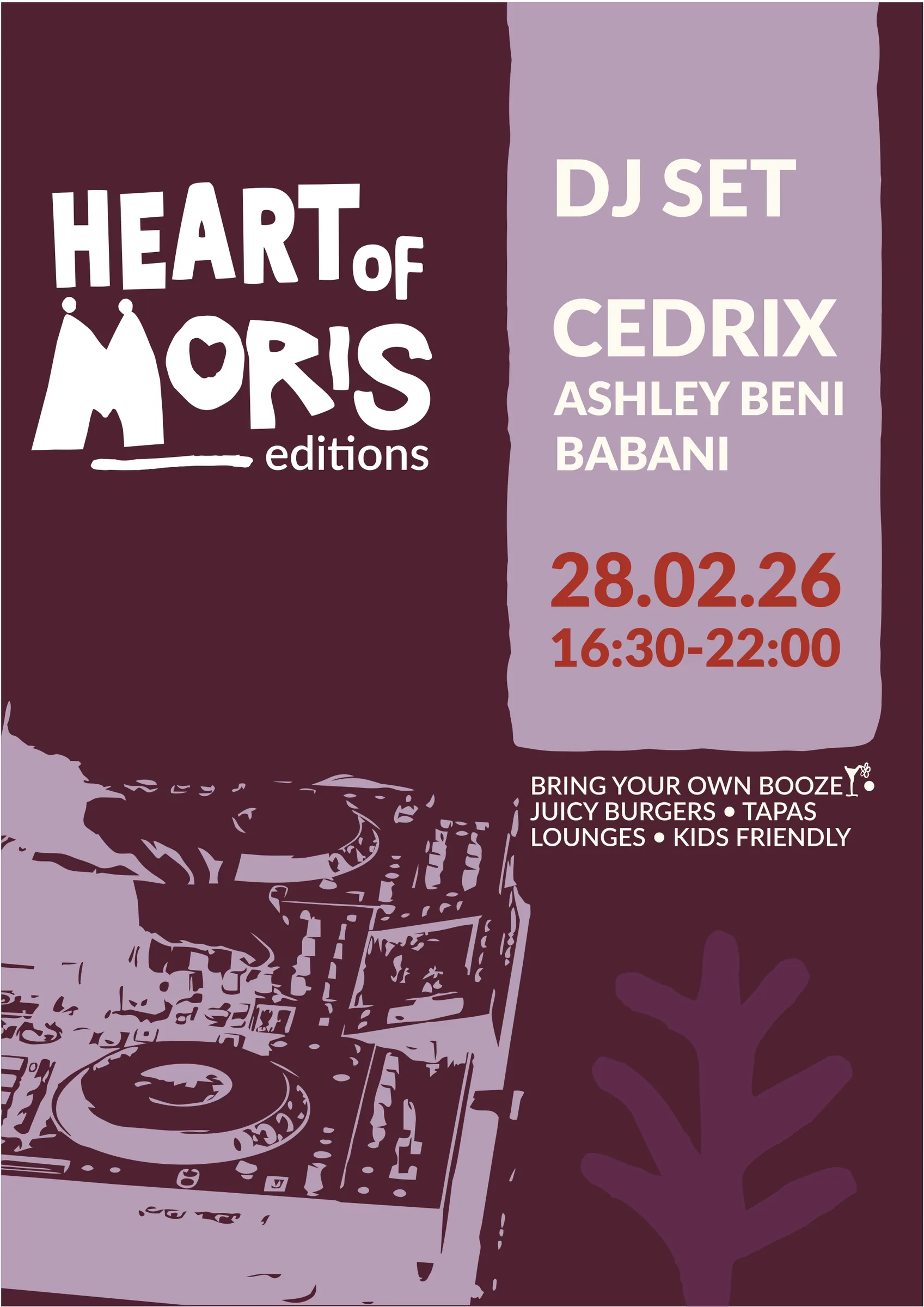
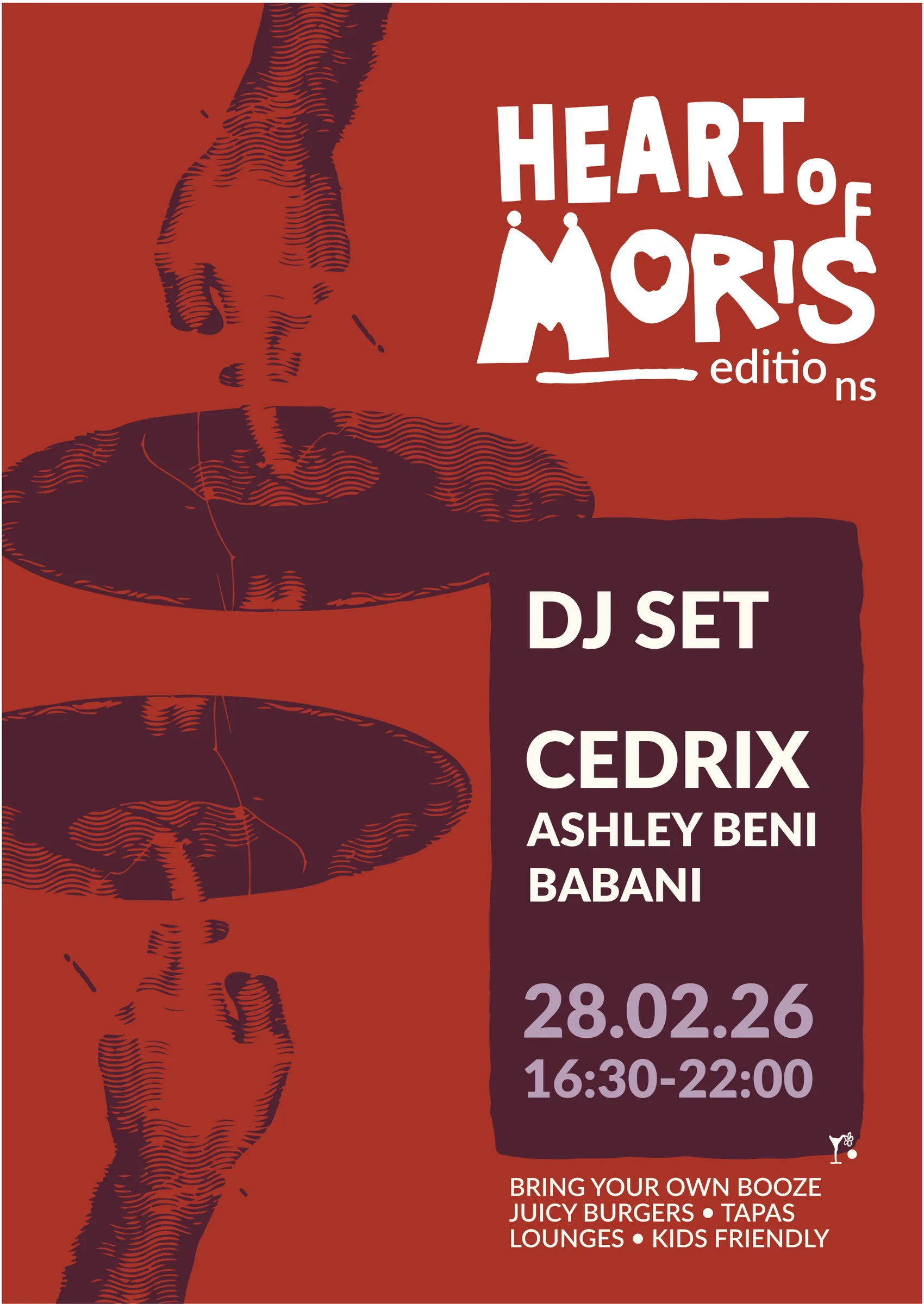
- DJ SET
- CEDRIX
- ASHLEY BENI
- BABANI
- 28.02.26
- 16:30-22:00
BRING YOUR OWN BOOZE • JUICY BURGERS • TAPAS • LOUNGES • KIDS FRIENDLY
DRAG THE PASSES
- music
- cocktail
- people
- shopping
- seats
- nature
Twinzen
Brand repositioning
From product brand to recognisable brand system.
What existed
The existing identity feels dated, visually weak, and overly decorative. It lacks a distinctive visual signature, making the brand difficult to recognise and differentiate.
Its current design language also risks ageing quickly, rather than building a timeless and recognisable brand presence.
- dated
- visually weak
- overly decorative
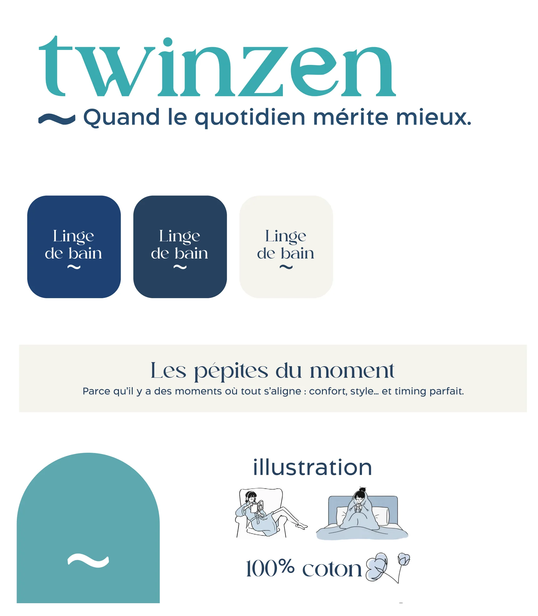
The strategy
Stripes. Colour. Recognition.
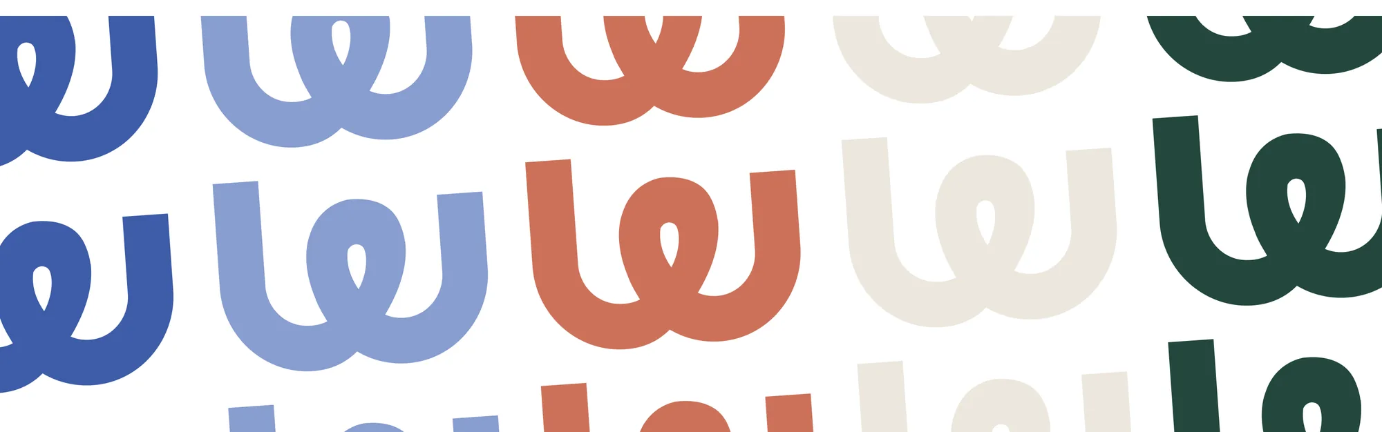
The rebrand was built around a simple, recognisable visual language. Stripes became the core brand asset, supported by a distinctive colour palette and flexible compositions designed to work consistently across digital and physical touchpoints.
01 — Stripes
A recognisable brand asset designed for flexibility.
02 — Logo
03 — Colours
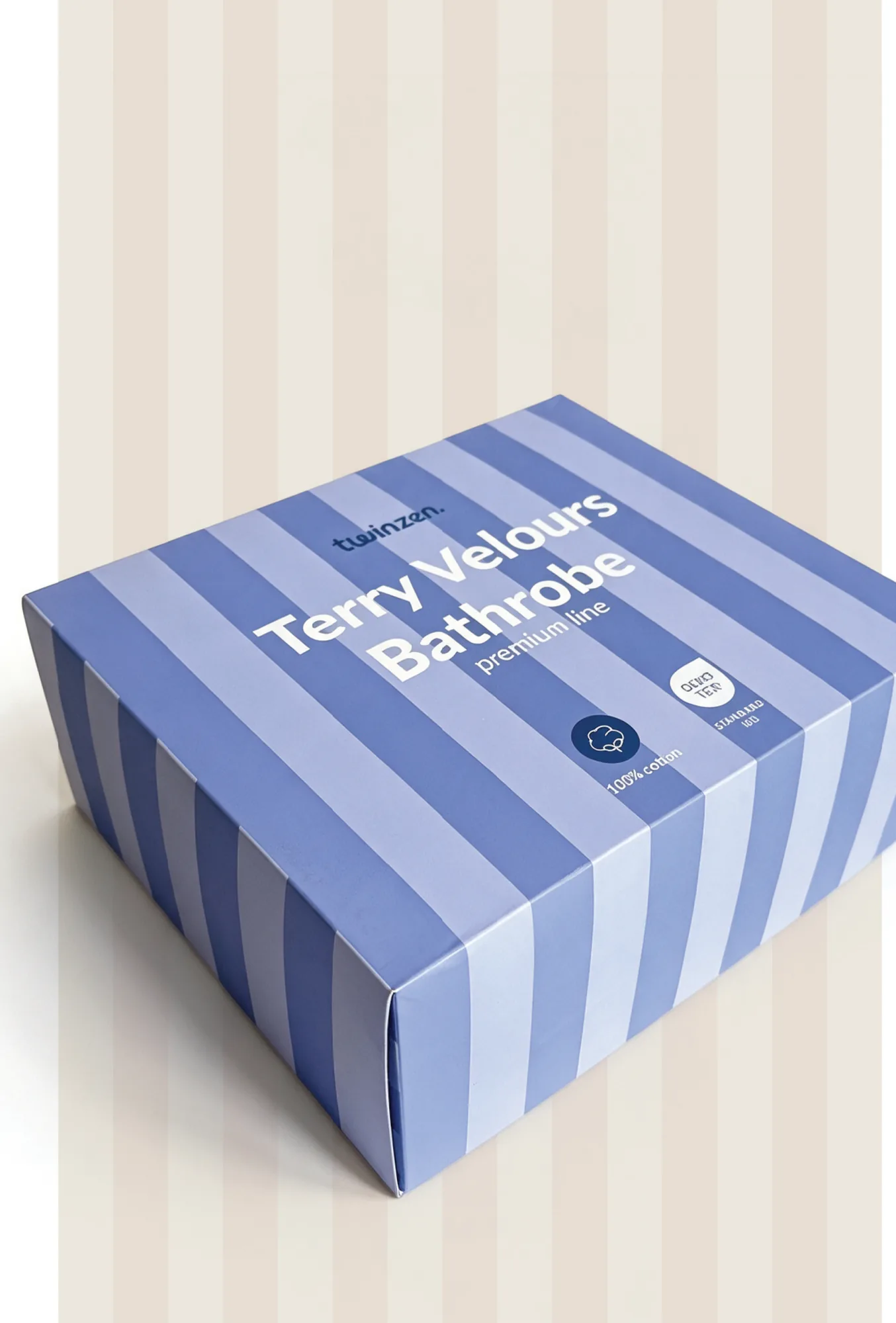
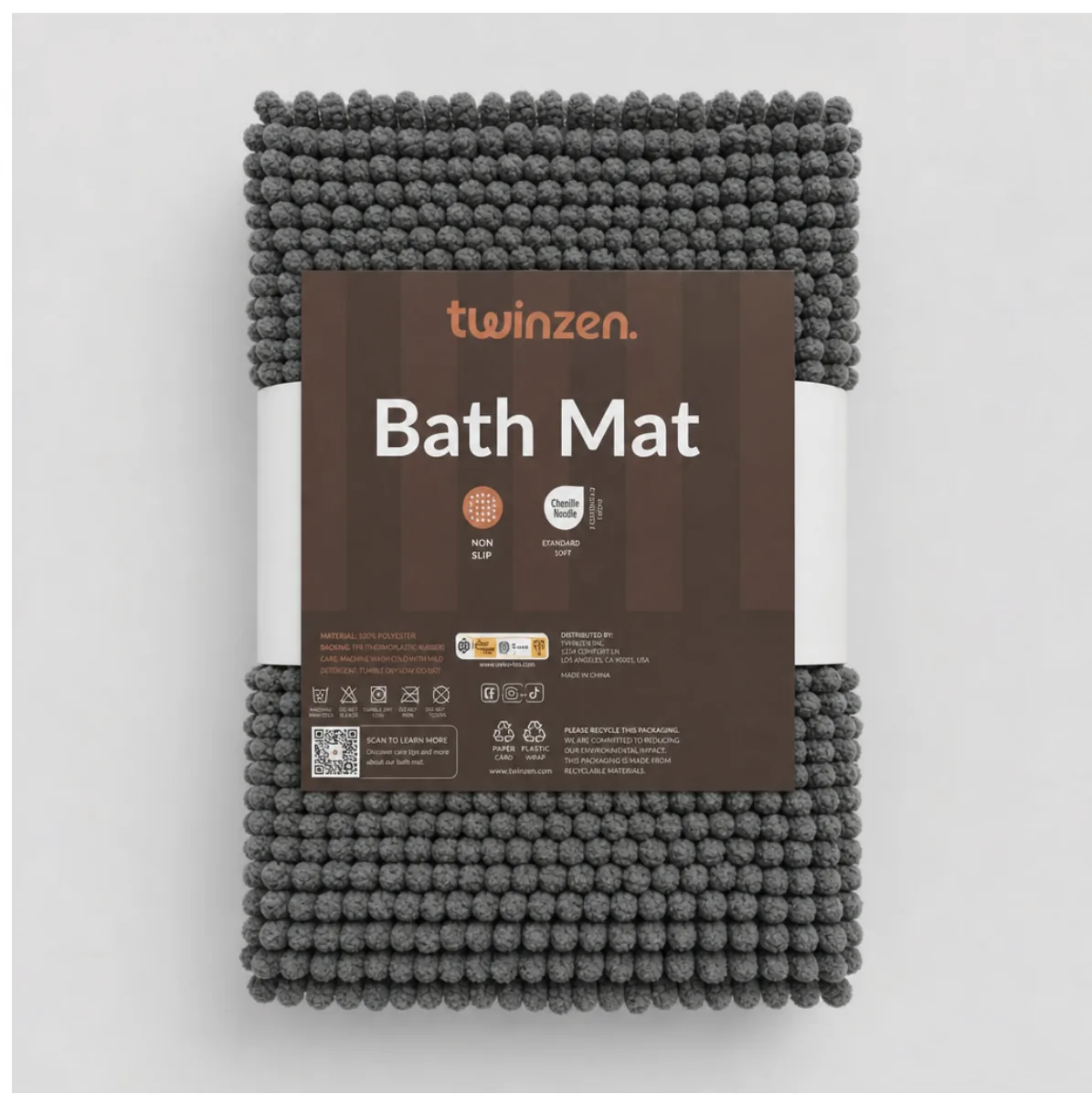
From system to shelf.
Designed to remain recognisable whatever the product is and wherever the brand appears.
Digital brand experience
Away from the conventional Amazon storefront, turning the brand identity into a bold, editorial-led experience that feels unmistakably Twinzen.
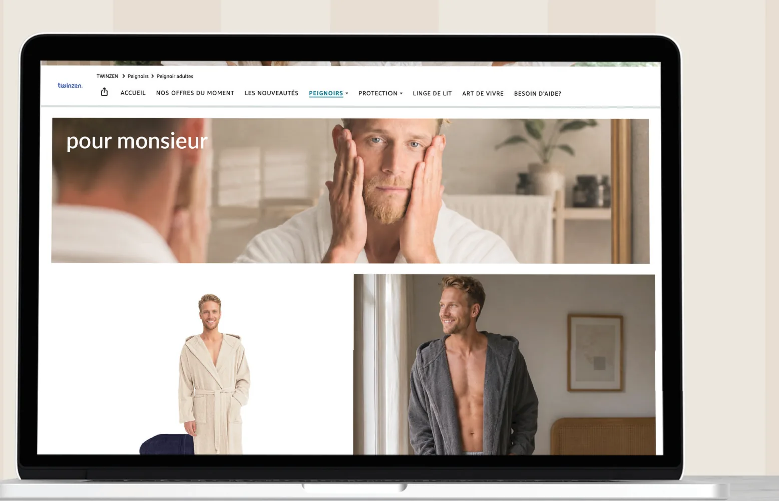
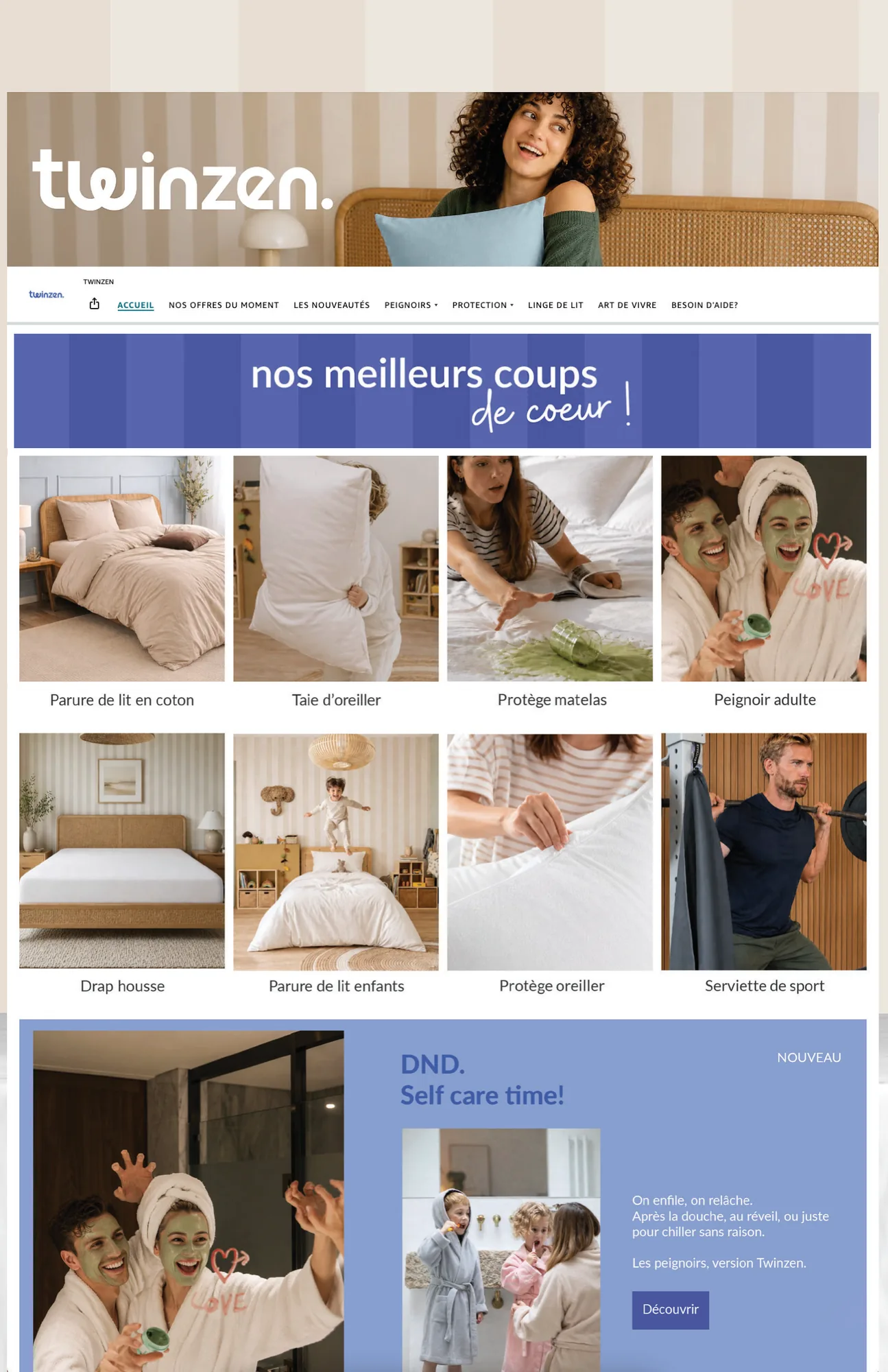
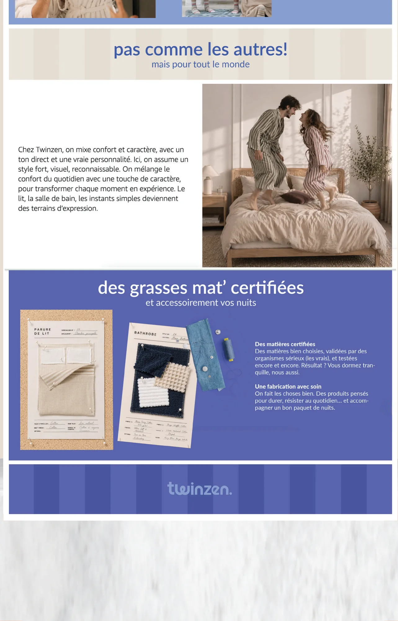
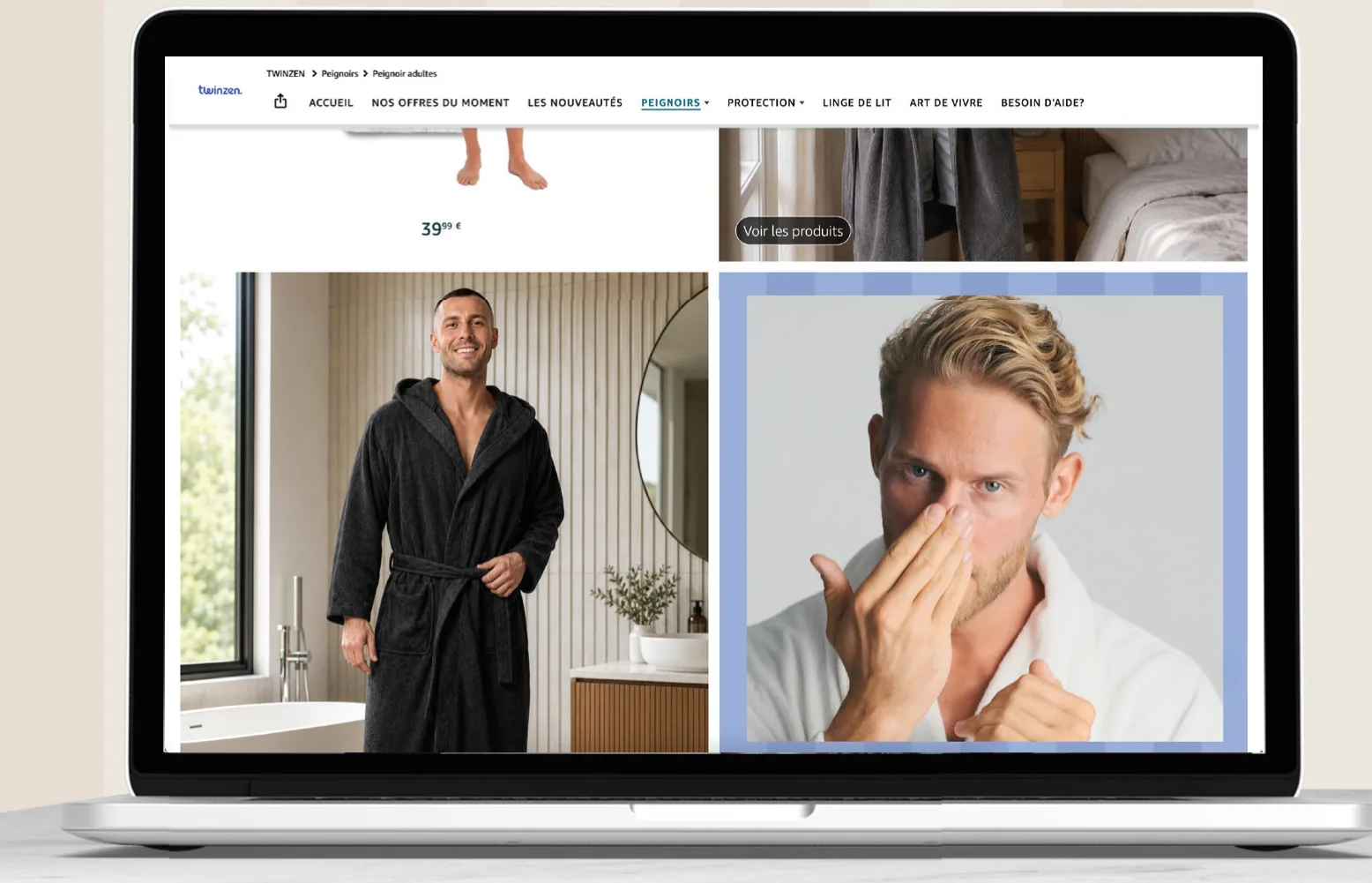
From product to experience
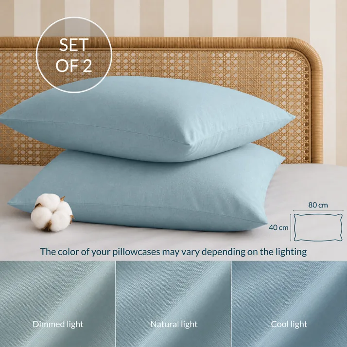
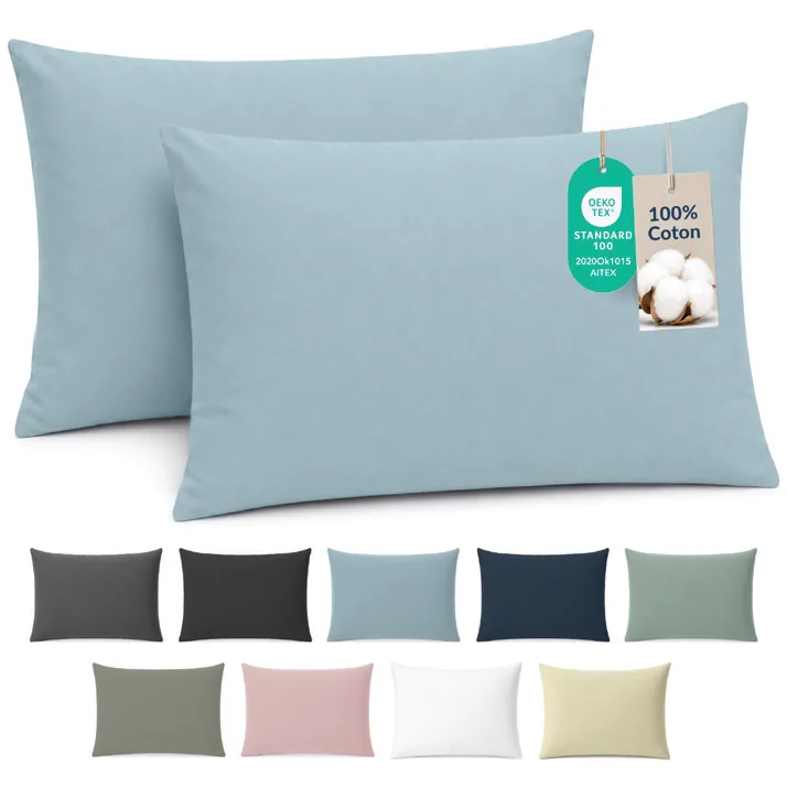
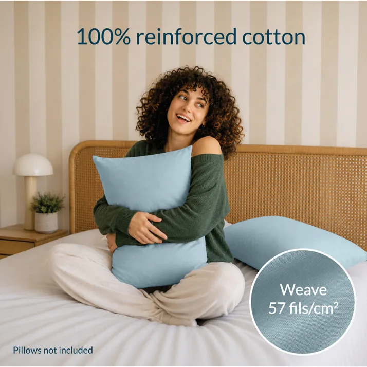
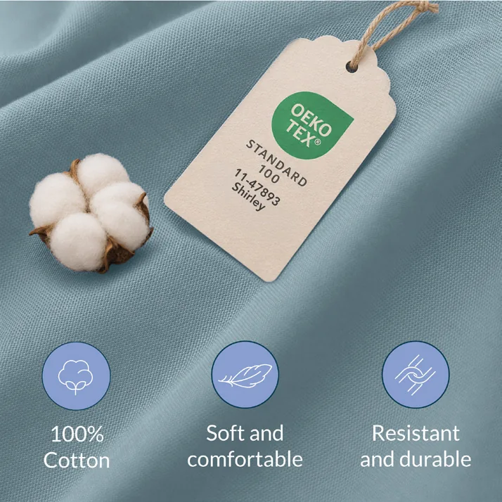
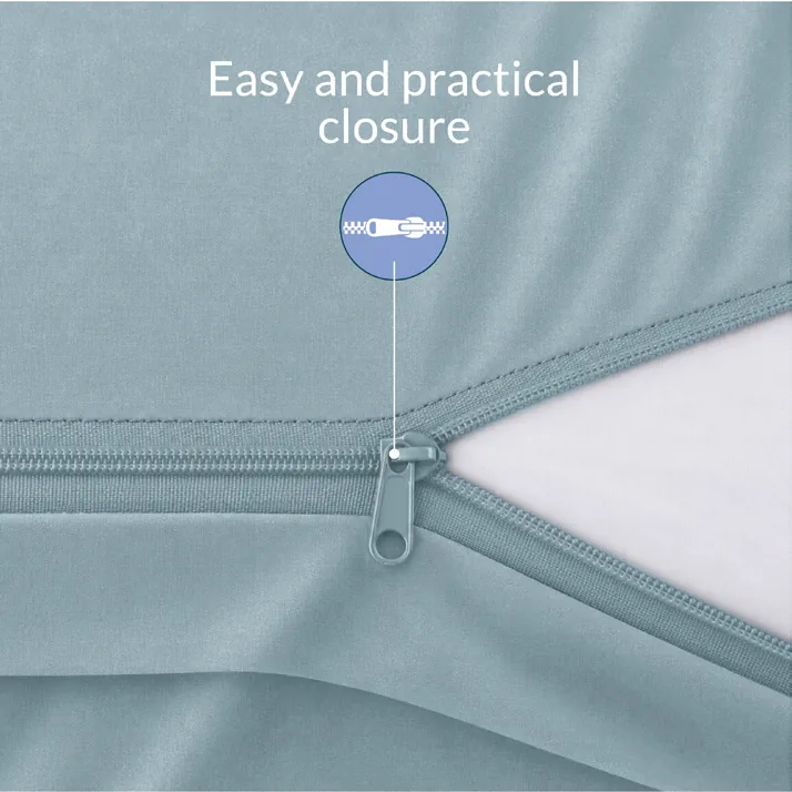
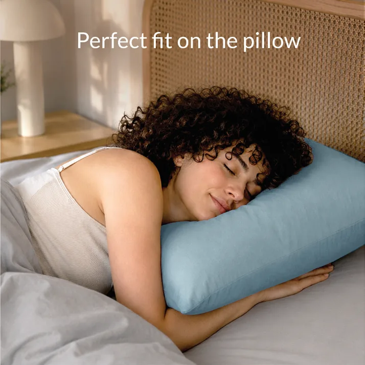
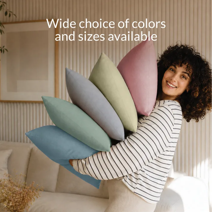
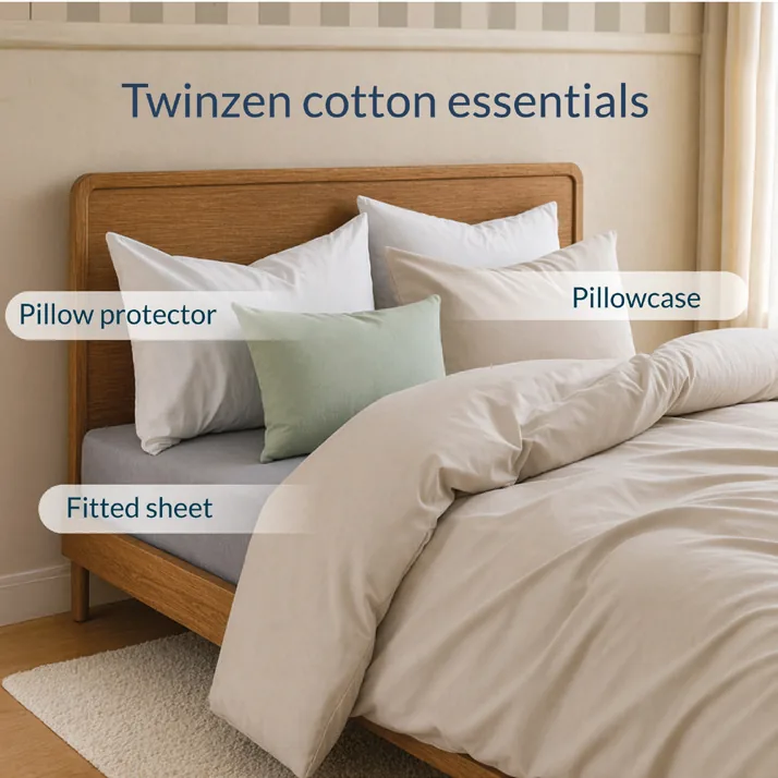
On Amazon, every visual is part of the brand experience: from the AI model generated, the energy of the photos, the interior design chosen.
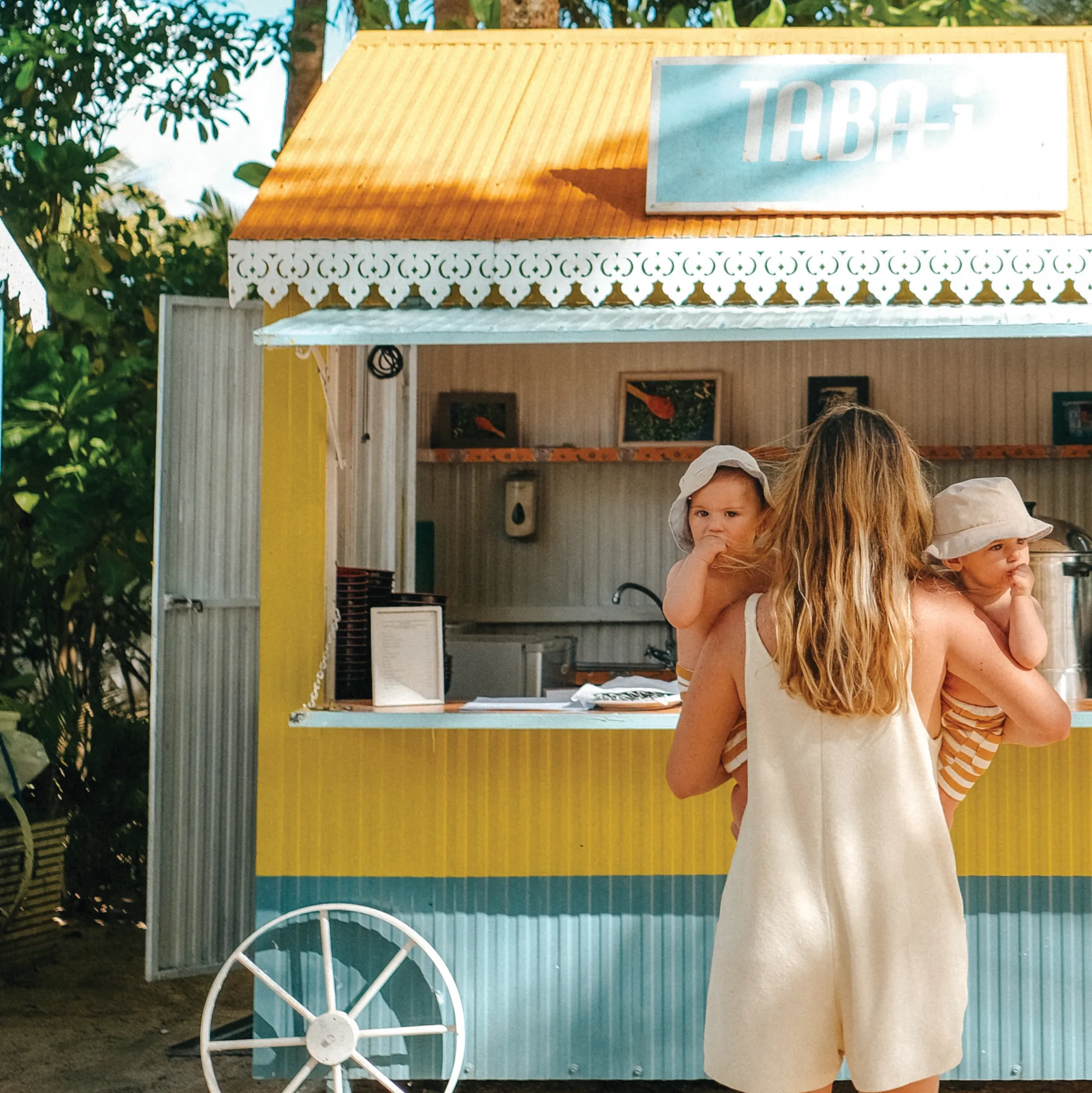
Attitude Hotels
9 YEARS OF BRAND EXPERIENCE
3A
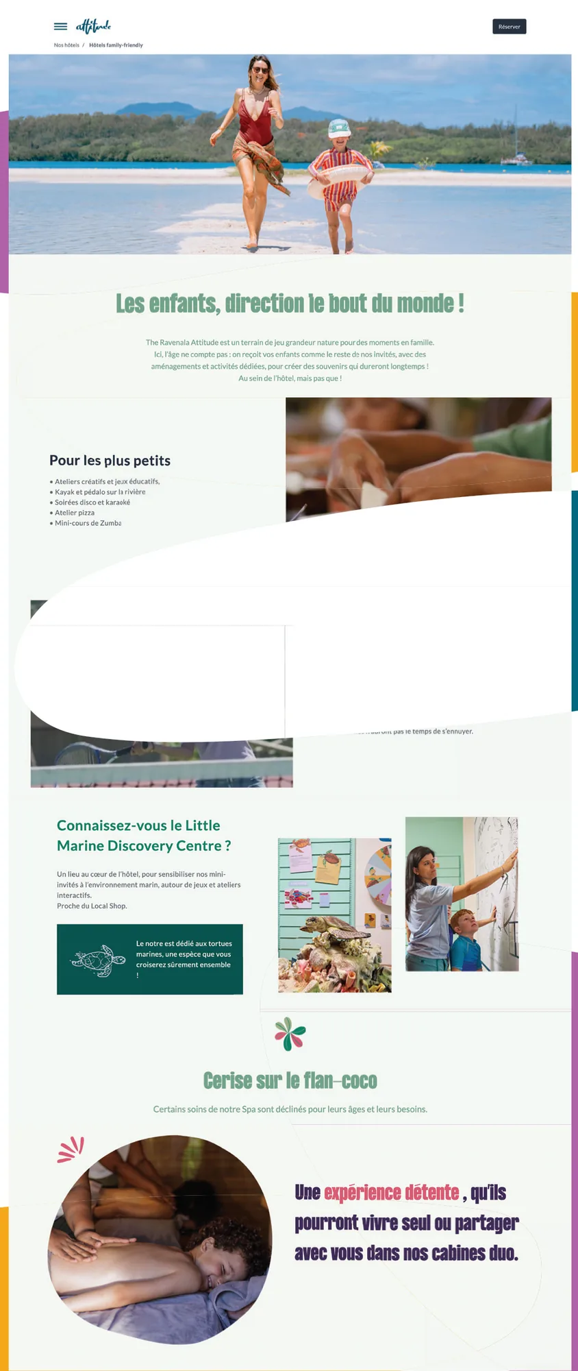
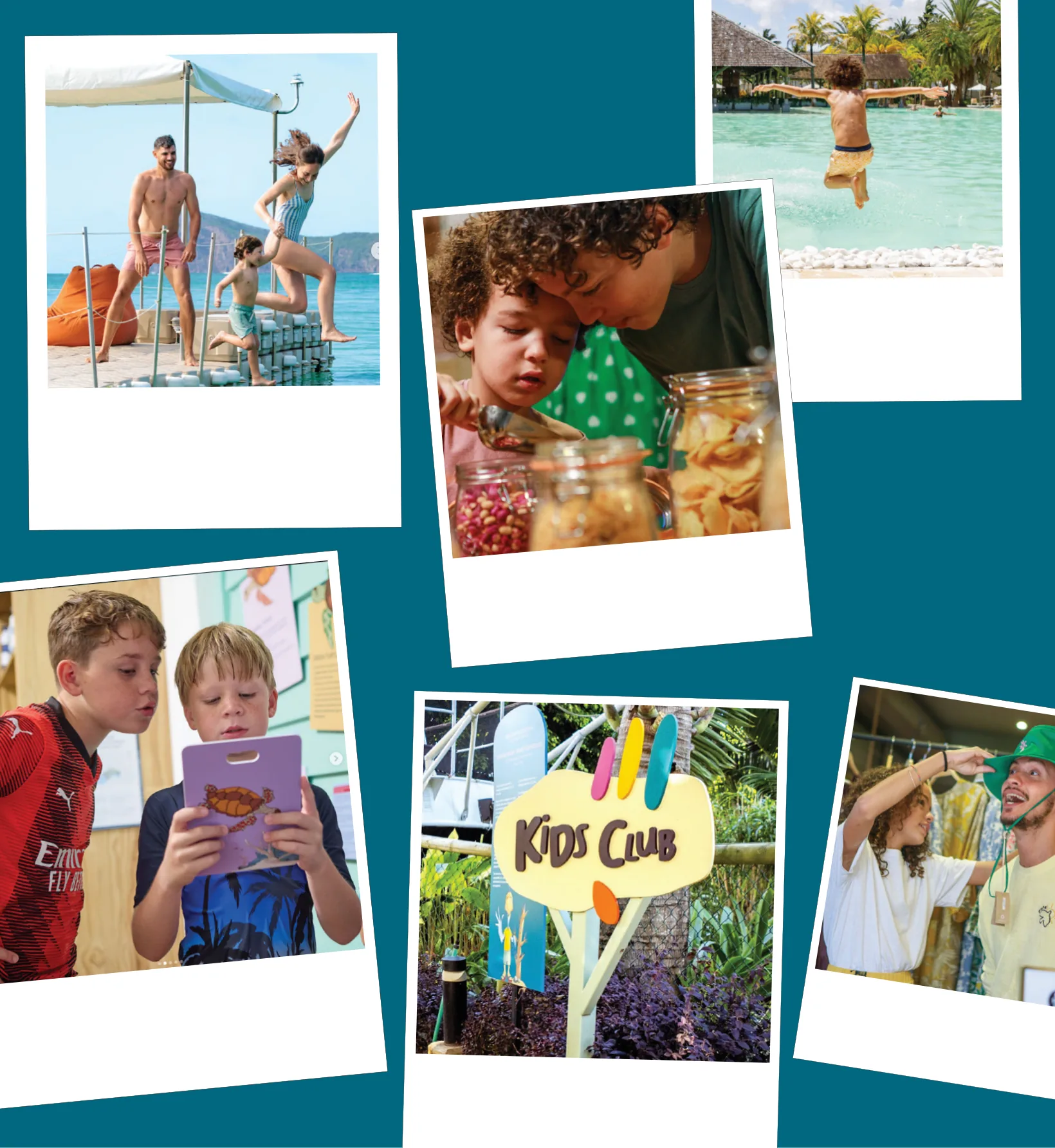
FROM KIDS CLUB TO FAMILY WORLD
The creative idea
The ambition was to move the family experience beyond the Kids Club and create a world that families could discover throughout their stay from the first digital touchpoint to the physical experience on property.
The art direction
Inspired by the belief that it takes a village to raise a child, the experience draws from the way children grow up in Mauritius, moving freely between homes, playing with neighbours, discovering traditional games and sharing local sweets and stories.
The journey starts before arrival by creating a visual and emotional connection through digital touchpoints before continuing into the physical environment.
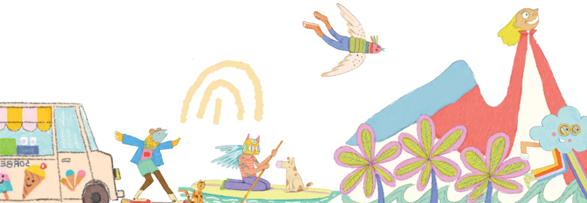
Building a visual world
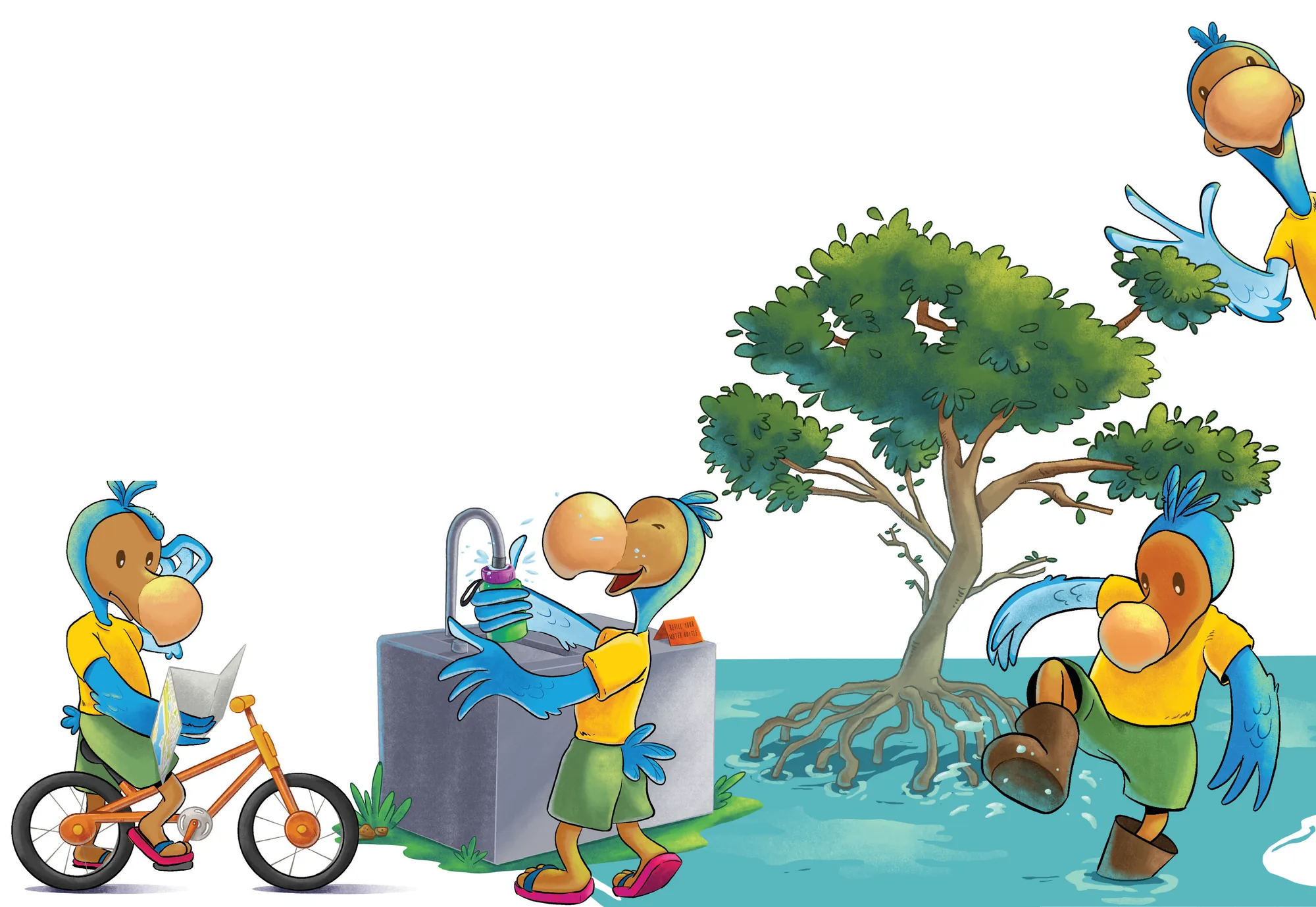
1. A recognisable protagonist
At the centre of the experience is AYO. More than a mascot, the character acts as a guide into the world of the Family Experience, helping children recognise, connect with and remember the brand across different touchpoints.
2. A world of friends
AYO was never designed to exist alone. TOTO, URSULA, SEASEA, CORA introduce different expressions, interactions and stories, reflecting the idea that childhood is experienced with others, not in isolation. Each of them represents a protected fauna around Family Friendly Hotel.
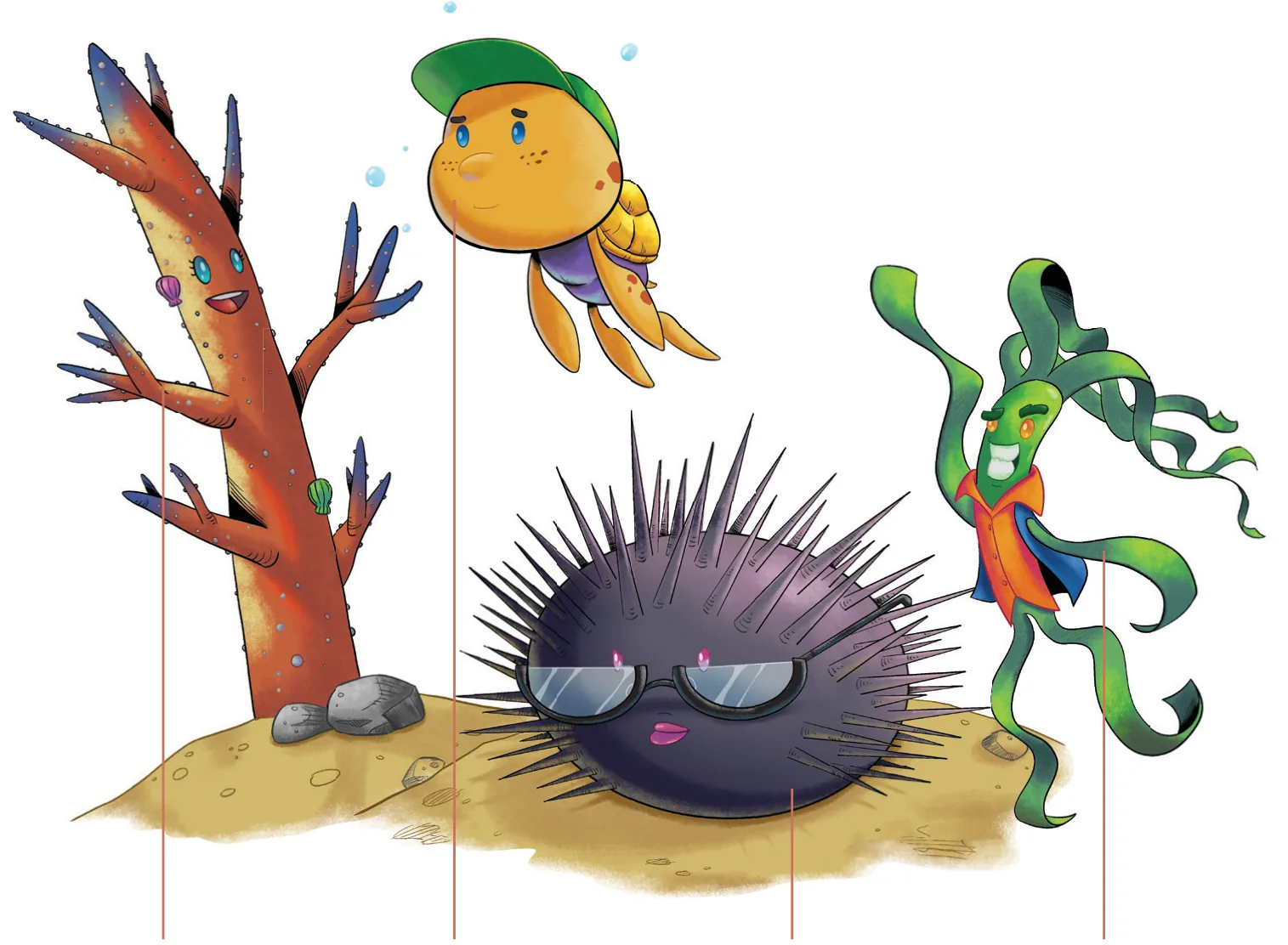
- CORAFriday Attitude
- TOTOThe Ravenala Attitude
- URSULACoin de Mire Attitude
- SEASEAZilwa Attitude
3. Belonging through play
From local food and games experience, exploring bazar, discovering fauna around the hotels to classic pool dips.
3A
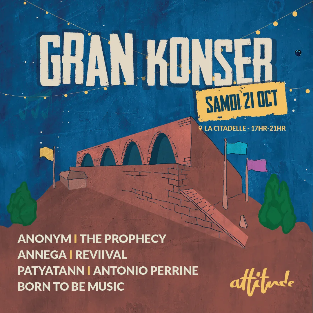
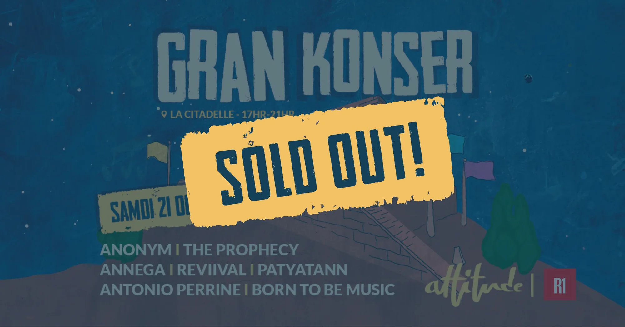
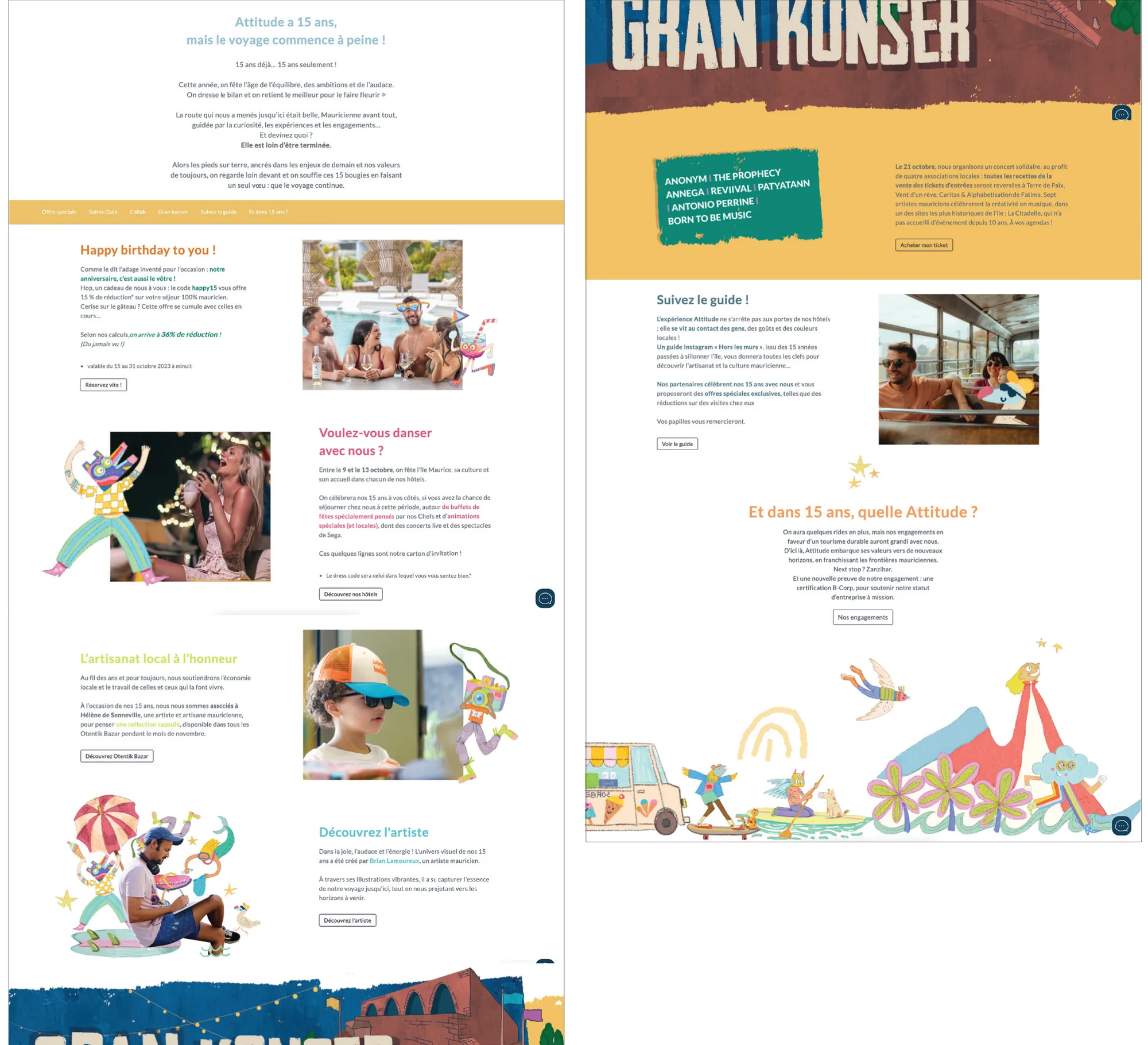
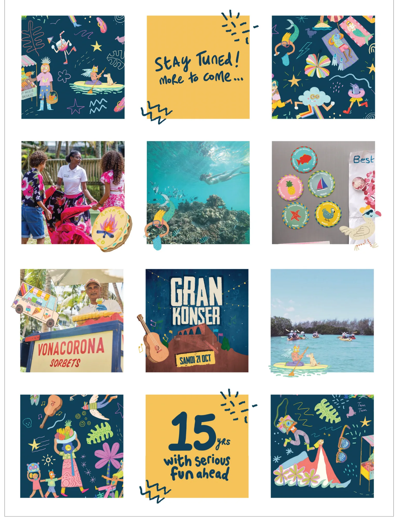
15 ANS — FROM BRIEF TO DELIVERY
Brief
Celebrate 15 years of Attitude with a distinctive anniversary identity that could unify the brand across every touchpoint.
Creative direction
Evolve the existing identity into a 15 Years visual system recognisable as Attitude, but with enough energy and flexibility to feel like a new chapter.
Design
Extend the anniversary identity across the website, social media, events, brand communication and campaign assets, creating one consistent visual language.
Production
Develop and roll out a flexible asset system across digital and physical applications, ensuring consistency across multiple teams, channels and activations.
Final experience
A cohesive 15 Years brand experience that turned a milestone into a year-long expression of the Attitude identity.
9 YEARS.MANY TOUCHPOINTS.ONE BRAND.
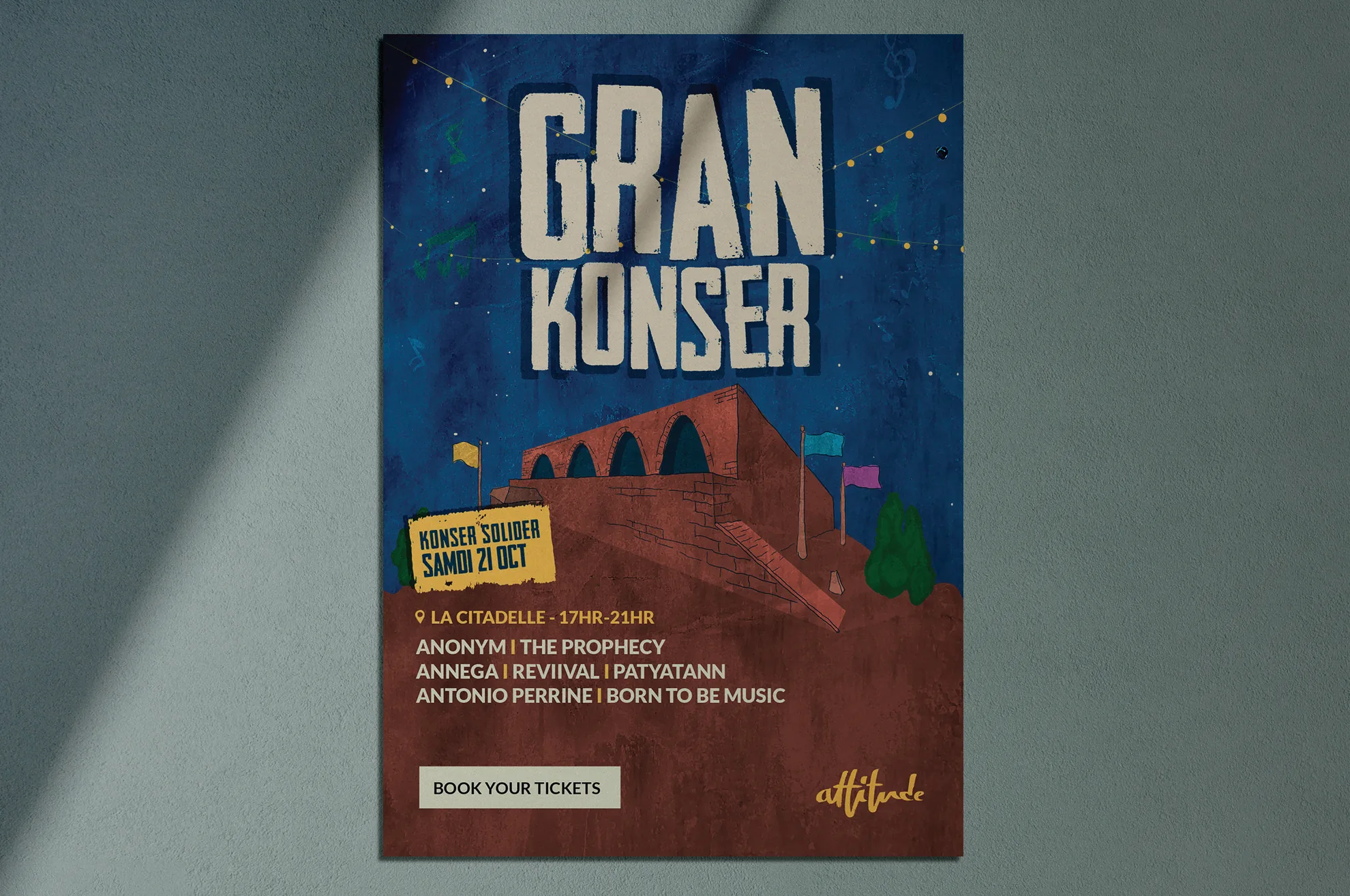
My work at Attitude extended beyond the projects featured here: from evolving the visual identity and designing communication systems, to shaping digital experiences, campaigns and social content across the hotel portfolio.
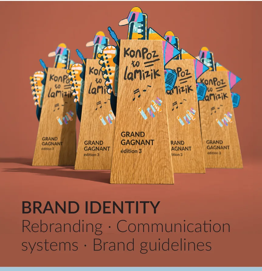
Brand identity
Rebranding · Communication systems · Brand guidelines
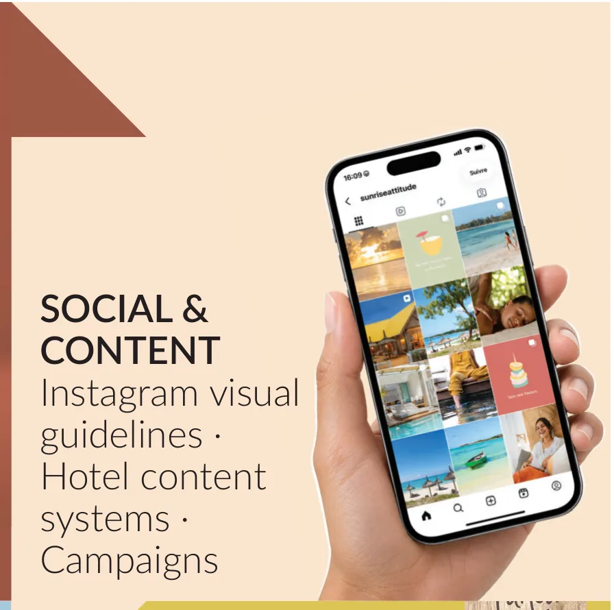
Social & content
Instagram visual guidelines · Hotel content systems · Campaigns
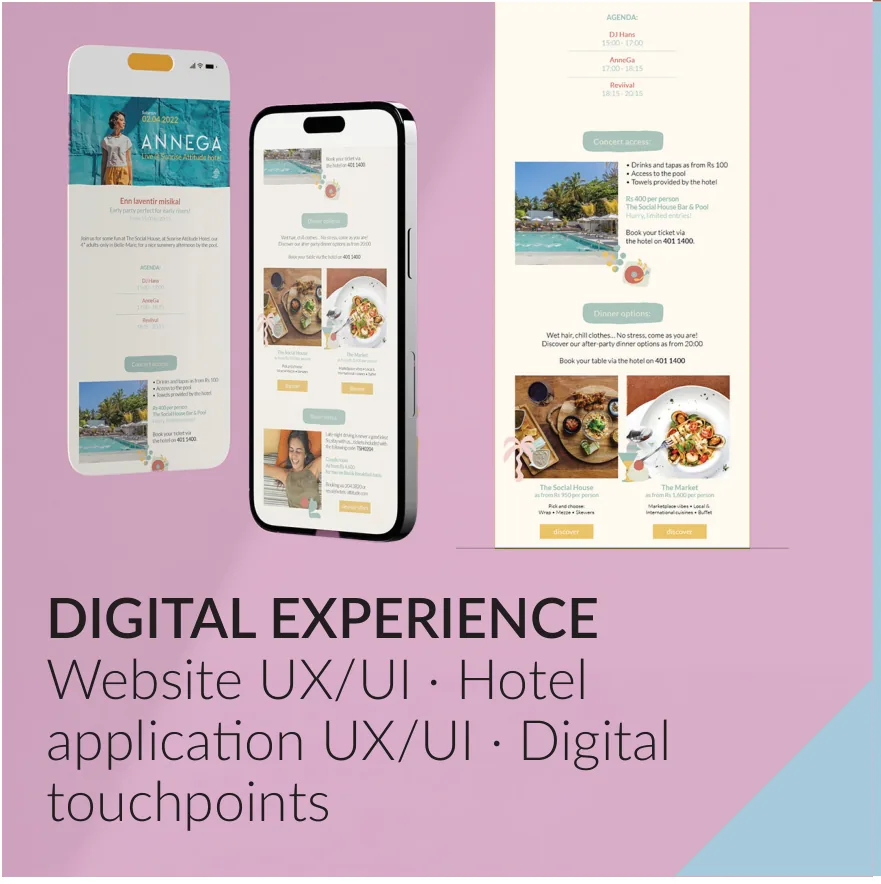
Digital experience
Website UX/UI · Hotel application UX/UI · Digital touchpoints
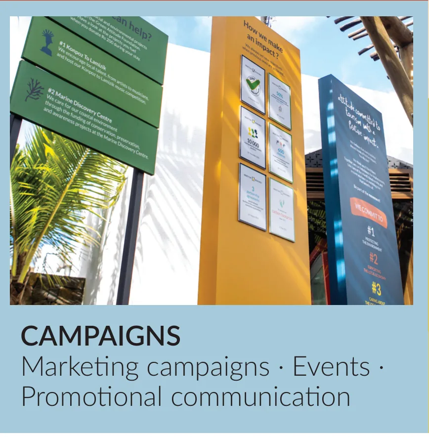
Campaigns
Marketing campaigns · Events · Promotional communication
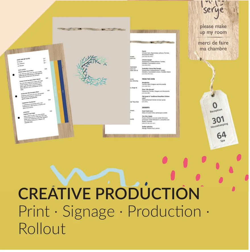
Creative production
Print · Signage · Production · Rollout
LET'S BUILD.
- PHONE
- +230 5858 5000
- linkedin.com/in/mikkyrama
I believe good creative work starts with understanding the bigger picture; the brand, the audience and the business and turning that understanding into ideas people can experience and remember.
- BMS INTERNATIONAL — 2024–NOWAmazon E-Commerce Brand DesignerCreative direction · Brand · E-commerce · Design mentor for Juniors · Amazon marketing design
- ATTITUDE HOTELS — 2016–2024Senior Graphic DesignerBrand · Brand experience design · UI and UX design · Campaigns · Creative Production · Design management process · Mentoring
- EVOLUTION LTD — 2014–2016Mac OperatorMagazine Layouting · Prepress design · Printing